The color trends for 2025 are beginning to take shape, with leading paint and design brands announcing their picks for the year. These choices reflect a mix of cultural influences, sustainability efforts, and a return to nature-inspired tones. Each brand selects colors that resonate with people’s emotions and needs and offers a glimpse into what we may see in fashion, interiors, and beyond.
From earthy greens to bold and invigorating reds, the 2025 color palette is as diverse as it is meaningful. Understanding these selections can help you incorporate the latest trends into your life with creativity and purpose. No matter if you are redecorating a home or simply want to stay ahead of the curve, these shades can inspire transformation.
Why Colors of the Year Matter
Colors influence our emotions and environments in subtle yet profound ways. Trends in color are often shaped by global movements, cultural shifts, and the collective mood of society. They offer a way to bring the zeitgeist into tangible spaces, which makes them a crucial element in design.
These yearly selections often impact what we use in home design, from choosing paint for a bedroom to coordinating furniture and decor. Staying informed about the year's trending colors gives you an edge in creating modern and relevant spaces. Let's explore what 2025 has to offer and how you can embrace these shades with confidence.
The Top Colors of 2025 and Their Meanings
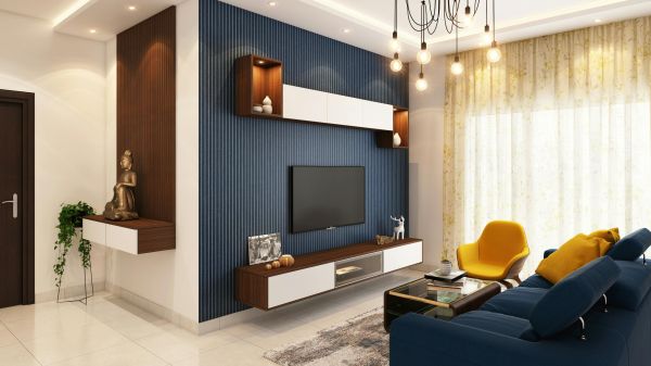
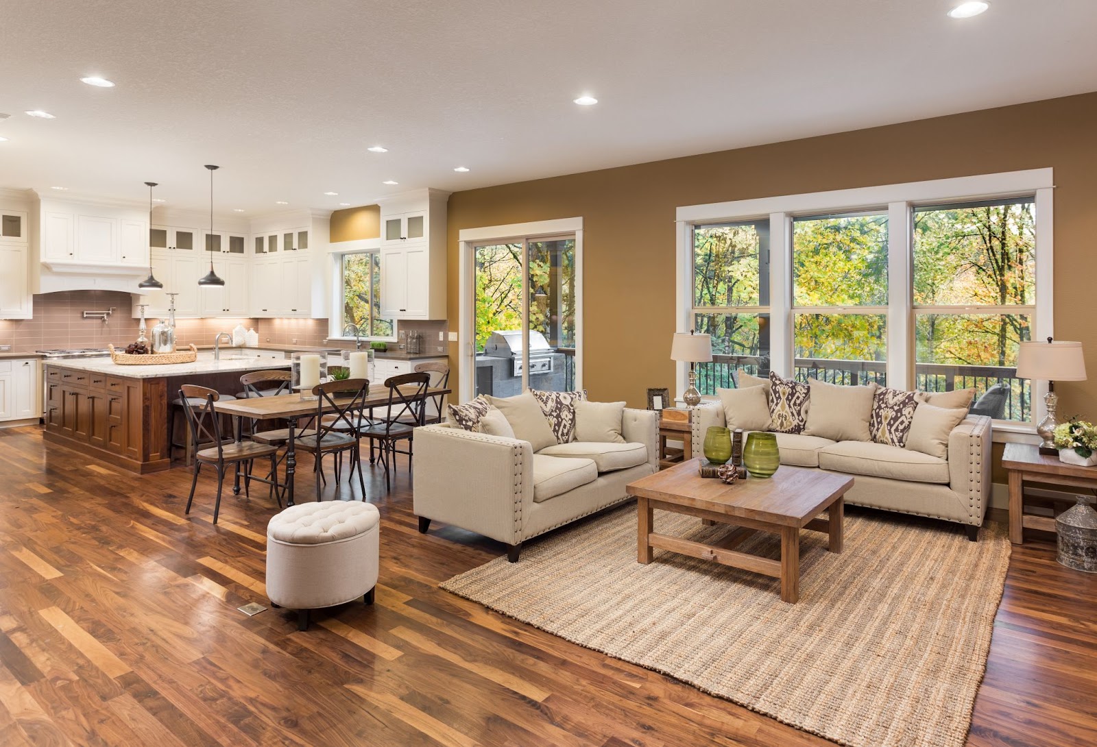
Earthy Greens and Deep Blues
Nature continues to be a major inspiration for color trends, and 2025 is no exception. Earthy greens like olive, sage, and moss reflect a collective yearning for connection to the environment. Similarly, deep blues reminiscent of oceans and skies evoke calmness and stability in a fast-paced world.
These colors aren’t just visually pleasing. They also bring a sense of grounding to spaces. Incorporating greens in living rooms or kitchens can evoke feelings of serenity and freshness, while deep blues in bedrooms or bathrooms add an element of relaxation and sophistication. When paired with natural materials like wood or stone, these shades create a harmonious and timeless aesthetic.
Neutral Tones with a Twist
Neutral shades remain essential, but 2025’s neutrals come with unexpected undertones. Beige might lean toward pink, while grays could show hints of green or blue. These versatile colors provide a sophisticated backdrop and allow other elements of your space to shine.
The beauty of these neutrals lies in their adaptability. A warm beige with pink undertones can soften a room and add a touch of elegance, while a gray with green hints pairs seamlessly with plants or natural decor These updated neutrals are ideal for creating a timeless look that can evolve with changing trends, which makes them a smart choice for large-scale design elements like walls or floors.
Bold Yellows and Energizing Reds
On the other end of the spectrum, bold and energizing hues such as fiery reds and warm yellows are making waves. These colors symbolize passion, optimism, and joy. They’re perfect for making a statement through a feature wall, an accent chair, or smaller decorative elements.
These colors can instantly uplift the mood and energy of a room. Reds can create an inviting atmosphere in dining rooms or kitchens and encourage interaction and vibrancy. Yellows work beautifully in entryways or playrooms and bring brightness and a cheerful vibe. To balance their intensity, these colors can be paired with muted tones or neutral furnishings for a modern, polished look.
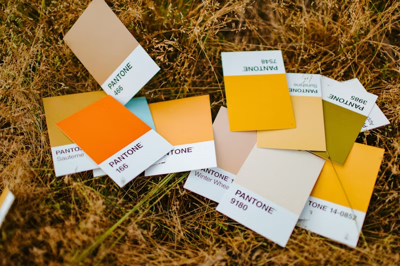
Pantone’s Color of the Year 2025
Pantone’s Color of the Year is always one of the most anticipated announcements in design. For 2025, the selected shade emphasizes connection and vitality. The chosen hue, Mocha Mousse, a rich coffee-inspired color, symbolizes warmth, comfort, and sophistication.
Pantone describes this color as versatile, which makes it ideal for interiors and fashion. It pairs beautifully with natural materials like wood, clay, and stone, and is a standout choice for eco-conscious design. This selection underscores the ongoing trend of blending boldness with nature-inspired tones and offers a perfect balance between dynamism and warmth.
A Table of Colors and Possible Uses
|
Brand |
Color |
Best Use |
|
Sherwin-Williams |
Moss Green |
Living rooms, kitchen accents |
|
Benjamin Moore |
Baked Terra Cotta |
Dining rooms, feature walls |
|
Behr |
Indian Sunset |
Bedrooms, outdoor furniture |
|
Dulux |
Deep Ocean |
Bathrooms, study spaces |
|
Valspar |
Golden Sand |
Hallways, cozy nooks |
How to Incorporate 2025 Colors into Your Home
The key here is starting small. Add a splash of color through throw pillows, rugs, or artwork. This approach allows you to test the waters before committing to larger changes.
For those ready for a bigger transformation, painting a wall or piece of furniture can make a bold impact. Pair bold shades like energizing reds with muted tones to create balance. For a cohesive look, use earthy greens alongside natural materials like wood and stone.
Color Psychology and Its Role in Design
Green — Balance and Growth
Shades of green symbolize harmony and growth, which makes them ideal for spaces where relaxation is key. A mossy green living room, for example, can create a grounding and peaceful atmosphere. Plants or wood textures enhance its calming effect and connect the indoors with nature. Green is also associated with renewal and healing, which makes it a great choice for spaces where restoration and self-care are priorities, such as meditation rooms or bathrooms.
Blue — Calmness and Focus
Deep blues inspire calmness and focus. They are perfect for studies or workspaces. Blue tones in bedrooms can also promote restful sleep. Pairing it with neutral shades like white or gray can create a clean and sophisticated look and enhance its tranquil qualities. Lighter blues evoke feelings of open skies and freedom, which makes them excellent for airy and spacious environments, especially in small or dimly lit areas.
Red — Energy and Passion
Red is a powerful color that commands attention and inspires action. It works well in social areas like dining rooms or kitchens, where energy and interaction are encouraged. Using it strategically as an accent color can add vibrancy without overwhelming the space. Accessories like cushions, rugs, or artwork in red can instantly energize a room, while softer reds, like terracotta or coral, can introduce warmth and intimacy.
A Quick List of Trending Design Tips
- Layer colors: Combine bold and neutral tones for a balanced, multidimensional look.
- Accent with textures: Pair colors with complementary textures, like soft fabrics or raw materials.
- Highlight architectural features: Use colors to draw attention to unique elements like moldings or alcoves.
Why Sustainability Shapes the Palette
Sustainability influences the materials we use and the colors we gravitate toward. Nature-inspired tones like green and blue reflect a deeper appreciation for the environment. These choices often come from a desire to create lasting, timeless spaces that align with eco-conscious values.
Final Thoughts
Color trends for 2025 reflect a dynamic mix of vibrancy and subtlety and offer options for every style and preference. Embracing these shades will allow you to create spaces that feel modern yet timeless, energized yet serene.
Understanding the psychology behind these colors and how they resonate in design makes it easier to transform your home in ways that reflect your style. Incorporating these shades brings balance, inspiration, and a touch of nature into any space. Take these insights and explore the endless possibilities with confidence.